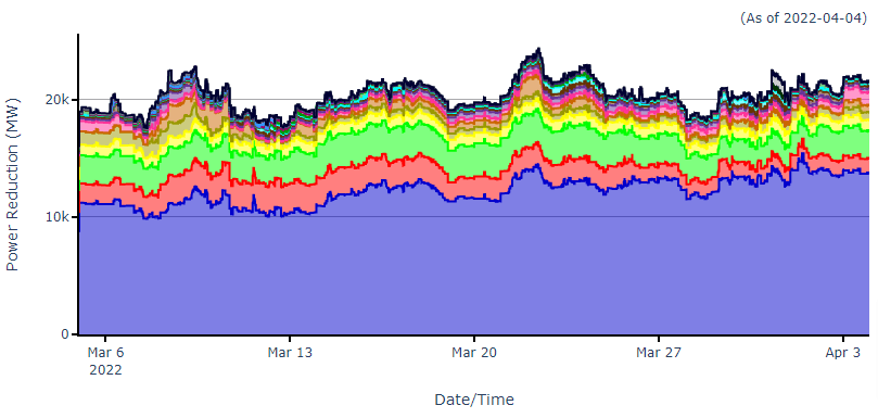
Using our data pipeline and CIM Insight tool, we present the following visualizations of ERCOT outages in plotly. The plots display outages as aggregate power reductions at points in time for a trailing 30-day period in stacked line charts. The charts have many interactive features, including zooming in on selected ranges, removing or highlighting data by legend item, and overall double-click reset.
The plots are compiled from data published by ERCOT: the Interim Unplanned Resource Outages Report, the 60-day DAM/SCED disclosure reports, and the latest CIM network model. We use the 60-day reports to map resource names to QSEs and market Resource Types, and we use the CIM model to map the names of combined cycle plants. More recent entries in the Interim Unplanned Resource Outages Report may reflect updates of previous entries, and so we have elected to remove older entries with strictly overlapping start/end date ranges for each resource. The visualizations presented here are presented as is, for demonstration purposes only, and no warranties or guarantees are expressed or implied. Please report problems to ggraham@cimviewsoftware.com.
Display Outages by Market Resource Type
Display Outages by Qualified Scheduling Entity (QSE)
The top 15 QSEs by average power reduction over the displayed time range are shown and the rest are aggregated into the “Other” category. Very recent changes in resource ownership will not be reflected here since the QSEs are mapped through 60-day DAM/SCED disclosure reports. The “Unknown” category denotes outages that could not be mapped to a QSE for lack of matching records in the 60-day reports. Power reductions are weighted by fraction of High Sustained Limit (HSL) for jointly owned resources.